2025-09-21
3. Exploratory Data Analysis
2025-09-21
Loading the Data
Now that we have our processed dataset from part 2, we can start exploring the data to understand the relationships between features and identify any patterns that might help us build a better predictive model. First, lets load the processed dataset and define which features are numeric since we’ll be focusing on them for most of our analysis.
import matplotlib.pyplot as plt
import seaborn as sns
import numpy as np

data = pd.read_csv('data/first_gen_pokemon_final_features.csv')
data.drop(columns=['id', 'flavorText', 'reasoning'], inplace=True)

numeric_features = [
    'hp', 'level', 'convertedRetreatCost', 'number', 'primary_pokedex_number',
    'pokemon_count', 'total_weakness_multiplier', 'total_weakness_modifier',
    'total_resistance_multiplier', 'total_resistance_modifier',
    'pokedex_frequency', 'artist_frequency', 'ability_count', 'attack_count',
    'base_damage', 'attack_cost', 'text_depth', 'word_count', 'keyword_score',
  'attack_damage', 'attack_utility', 'ability_damage', 'ability_utility'
]

all_features = [col for col in data.columns if col != 'hp']
print(f"Total features: {len(all_features)}")

numeric_cols = data[all_features].select_dtypes(include=[np.number]).columns.tolist()
print(f"Numeric features: {len(numeric_cols)}")

print(f"Number of rows:", data.shape[0])
Total features: 117
Numeric features: 115
Number of rows: 4470Before we dive into visualizations, lets get a high-level overview of our dataset structure and see what we’re working with. We can see that our dataset has 4470 rows and 117 columns after feature engineering.
Box Plot and Histogram of HP Distribution
We can first take a look at the distribution of the target variable, HP. We can see that the distribution is right-skewed, with most cards having lower HP values and a few cards having very high HP values (outliers). Additionally, this is furhter highlighted by the box plot which shows several outliers above the upper whisker.
feature = 'hp'

fig, axes = plt.subplots(1, 2, figsize=(12, 4))

axes[0].boxplot(data[feature].dropna())
axes[0].set_title(f'Box Plot of {feature}')
axes[0].set_ylabel('Value')

axes[1].hist(data[feature].dropna(), bins=30, edgecolor='black')
axes[1].set_title(f'Histogram of {feature}')
axes[1].set_xlabel('Value')
axes[1].set_ylabel('Frequency')

plt.tight_layout()
plt.show()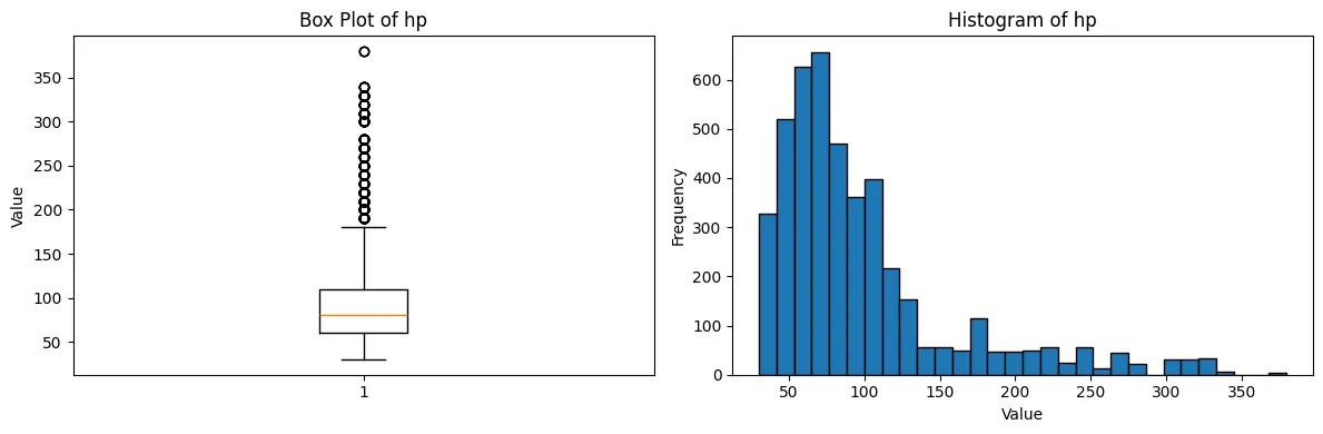
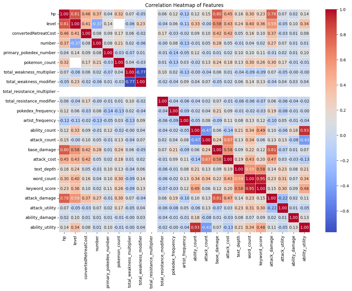
Correlation Heatmap
Next, we can look at the correlation heatmap to see how the features are
correlated with each other and with the target variable, HP. We can see
that a few variables have a strong correlation with HP, such as level,
base_damage, and attack_damage. These features may be important
predictors for our model. We can also see one feature that does not have
any correlation with any other features, total_resistance_multiplier.
This feature may not be useful for our model and can be dropped.
Surprisingly, the correlation between attack_damage and hp is not as
high base_damage and hp. This suggests that while the estimated
average damage of the attack is important, the explicit maximum damage
value may be a better predictor for HP.
corr_df = data[numeric_features]

corr_matrix = corr_df.corr()

plt.figure(figsize=(14, 10))

sns.heatmap(
    corr_matrix,
    annot=True,
    fmt=".2f",
    cmap="coolwarm",
    linewidths=0.5
)

plt.title('Correlation Heatmap of Features')
plt.show()